
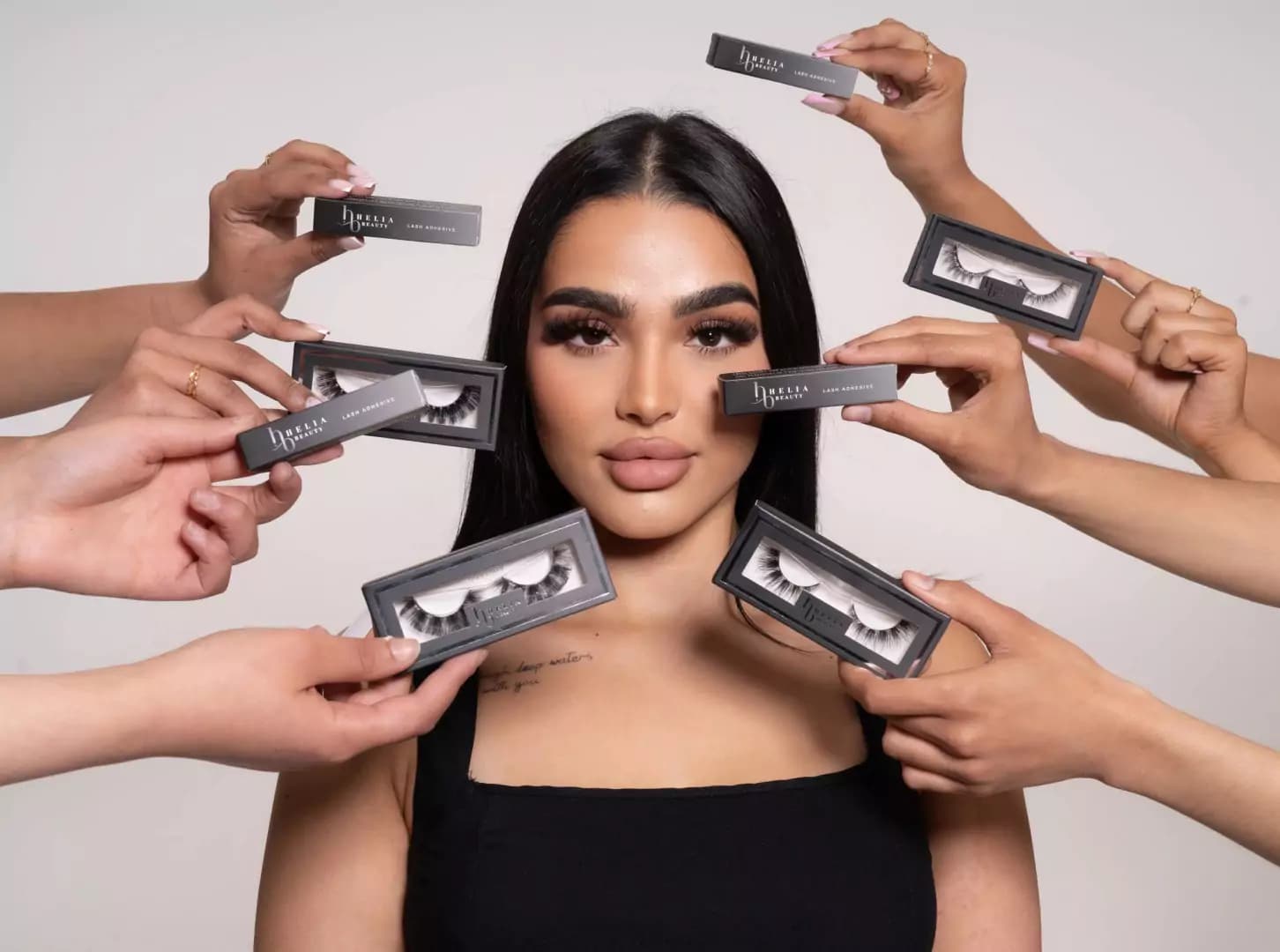
Refreshing Helia Beauty’s Online Store
A smoother design, modern styling, and smart automations gave Helia Beauty a website that feels professional and easy to shop.
The Story
Helia Beauty had recently built a new website but weren’t happy with how it looked or worked. Some areas had no padding and everything felt cramped. Decorative images took up too much space, forcing visitors to scroll without value. Old-style gradients made the site look dated and the overall design didn’t reflect a modern beauty brand.
Their store emails, like order confirmations, weren’t customised or properly active. Product pages also had issues: images were stretched and awkward, with narrow widths and oversized heights that made the layout feel unbalanced.
What We Did
Smart Website
We redesigned and adjusted key parts of the site:
- Added proper padding and spacing for a cleaner look.
- Removed oversized decorative images that distracted from shopping.
- Updated the fonts to a more modern and stylish style.
- Fixed product pages by reducing image height and increasing width so they displayed naturally.
- Customised store emails like order confirmations to match the brand.
Smart Website Automation
To improve the shopping experience, we built a custom system that automatically hides products as soon as they sell out. Instead of showing unavailable items, they instantly switch to draft mode, keeping the store tidy and frustration-free for customers.
The Outcome
Helia Beauty’s website now feels modern and professional. Pages are easier to browse, product images look natural, and emails feel on-brand. The automation also ensures customers only see products they can actually buy, creating a smoother shopping journey from start to finish.


Related Works






Ready to start your journey?
Every case study is a partnership. At Minutes Agency, your goals are ours, and the results speak for themselves.